A Tour of the Sitecore Experience Accelerator (SXA) (Part 2)

In Part 1 of this post, we did a walkthrough of Tenants, Themes, and Sites. In Part 2, we’ll examine Grids, Page Designs, Rendering Features, and Creative Exchange.
Grids
The next major front-end integration is the support for three major grid frameworks: Bootstrap, Foundation, and 960. You can see the grid columns by toggling the Grid checkbox on the Experience Editor view tab, and you can add structure to your page by adding “Splitter” renderings, found under page content. Let’s use the “Splitter (Columns)” rendering, found under the “Page Structure” heading in the toolbox. This creates a rendering that manages columns. It defaults to two, but you can change that number using the + and – icons:

If you click inside of it, you can access the individual columns:
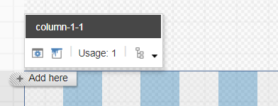
Now, clicking on the paint can icon allows you to set the grid properties for the column. These options change depending on the grid system selected when you created the site. Here are the options for Bootstrap and Foundation:
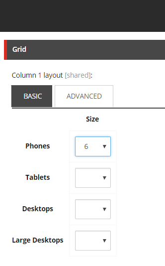
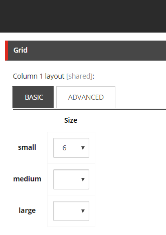
Grid features such as vertical and horizontal Spacers will primarily be used by designers to structure page layouts.
Page Designs
Structuring page designs using the grid system, spacers, and components is an involved process, so SXA provides a mechanism for locking down designs and reusing them: Page Designs and Partial Designs.

Page Designs allow you to specify a set of renderings for a given template type, similar to setting presentation on Standard Values, while also letting you swap one design for another one. Page Designs do not specify presentation directly. Instead, one adds renderings to Partial Designs, which are then composed into Page Designs.
Partial Designs, in addition to accepting renderings directly, can be based on other Partial Designs. This is a very flexible mechanism, as it supports both composition (Page Designs) and inheritance (Partial Designs).
In the following walkthrough, I recommend enabling the “Navigation bar” option, so you can see what is being edited. Let’s start by creating two Partial Designs using inheritance. Open Experience Editor on the Home item, go to the Experience Accelerator ribbon, and click “Partial Designs/Insert Partial Designs,” and create one called “My Header.”

Note that the Navigation Bar will show that you are no longer on the Home item, but rather at

Now, create a second Partial Design, this time called My Hero Header. When the Experience Editor is open to a partial design, the “Base Partial Design” button becomes enabled. Click it, and select the My Header as a base partial design. Note that you will need to save the page before the “My Hero” elements are visible. Drag an image to the middle, and save it. You should end up with something like this:

To use these partials, you need to attach them to Page Designs. You can create Page Designs from the Experience Accelerator ribbon by clicking “Page Designs/Insert Page Design”, and then you will be prompted to select partials to include.
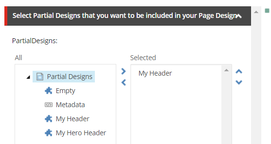
Create two Page Designs: Header Design and Hero Design. Add the “My Header” partial to the first, and “My Hero Header” to the second. Save, and now create a new page. Use the Experience Editor button “Pick Page Design” to set the page design on the new page. You can also make this the default for a given template by selecting the “Site Page Designs” button below it.

Page Designs and Partial Designs will be used by designers to compose pages, with input from the Solution Architect to ensure that the structuring of these assets is well organized. Once Page Designs are in place, and have been associated with templates, authors should not need to work with them, unless it is desired to present authors a choice of designs. Care should be taken, as it does not appear that Page Designs can be restricted by the base template, so there is the risk of an author selecting a Page Design that does not work correctly with the current template.
Rendering Features
You have already seen renderings in the above walkthroughs, and they are a base Sitecore feature. However, SXA does add several constructs.
Styles
First, and simplest, SXA renderings have a “Style” field, which directly controls the addition or removal of CSS selector classes. If you click on one of the renderings you’ve added, and select “Edit component properties”:

you will find a Styles section, which allows direct control of CSS selector classes:
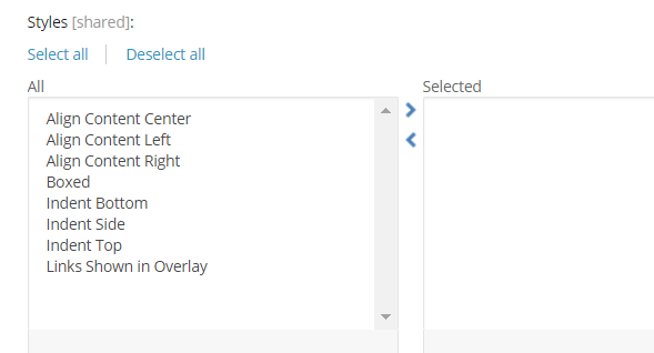
These style options are defined at
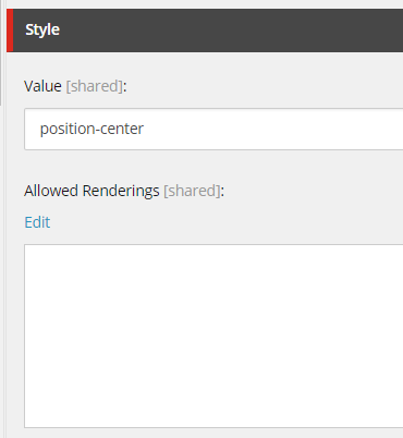
Rendering Variants
SXA introduces the concept of Rendering Variants to allow detailed configuration options to be bundled into a single drop-down selection option. For example, the Title rending we’ve used above wraps the title in a div tag, but this can be controlled through Rendering Variants, a new construct located in:
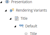
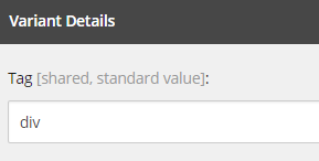
Now you could change this to H1, but it is more logical to create an H1 variant, and then you can select that directly on the renderings:
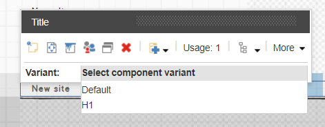
(Thanks to Jason Wilkerson for this example, from the presentation I linked to at the end of this article.)
By moving these presentation details to content, Rendering Variants allow SXA to allow a fixed number of presentation components to cover a very wide range of use cases. Further, since these variants are Sitecore items, they can be restricted by user role if necessary.
Complex and Composite Renderings
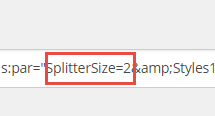
SXA introduces two new classes of renderings, complex and composite. We’ve seen complex renderings with Splitters, which allow you not only to add columns or rows, but to set attributes on these sub-elements. All this information is stored in the Rendering field. For example, the screenshots below, taken by examining the Final Layout field with Show Raw Values selected, shows where SXA stores the number of columns:

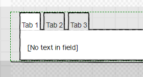
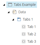
“Composite” renderings are somewhat different. They have traditional data sources, but the data sources have child items. So for a Carousel or Tab component, you can see the individual tabs as content items that are children of the data source:
Creative Exchange
The real showstopper feature of SXA is Creative Exchange, which allows a site to be exported as static HTML and resources, and then have these ingested back into the Sitecore solution. The value of this feature is that it allows front-end development to continue simultaneously with back-end development, and removes much of the overhead of having to move static resources and markup changes into the Sitecore solution. Designers and front-end developers can add JavaScript and CSS files to the Themes folder to have them incorporated into the media library, and they can add CSS classes directly to the HTML to have them be converted into the Styles elements you saw earlier.
With the most recent releases, this feature has been improved to allow the use of a server directory rather than a zip file, and Gulp scripts have been added to make this a live sync operation (called Creative Exchange Live).
To experiment with this, create a page with a title rendering, then click Export, and select Export to Server. This will save the site to the Data\packages\CreativeExchange. If you look at the HTML of the rendering, you will see in the markup, indications of where you can add CSS classes. I have added a class afterwards called “some-demo-class”:

If you click the “Import” option, you get a report indicating that the new class has been added:

And you now see this new style added to the component:

And to the HTML returned by Sitecore:

Using this feature, a front-end developer can make a modification to static site, verify it works, then ingest it into Sitecore, thereby making the change live, and making the style available on other renderings of that type. This is an impressively integrated workflow, and does much to break down the front-end/back-end wall.
Other Features
There are a host of other features I haven’t covered in this article, ranging from the ability to serve JSON (called “Data Modeling” in the documentation), to support for configuring metadata so that Twitter renders links attractively. The settings tree created when you spawn a site gives a sense of the breath of this module:

Jumping out at me on this list are configuring CORS (allowing resources to be shared across URL domains), setting up Redirects, configuring Social Media links, and setting up the standard “This site has cookies” warning. A lot of journeyman work has been mapped out and set up, and this list grows with each release.
Conclusion
Built on top of Sitecore XP and the open source Sitecore PowerShell Extensions module, there is nothing that SXA offers that a deeply experienced Sitecore architect and development team could not implement, given unlimited time and budget. The real magic lies in SXA’s consistency, adopting a few foundational concepts and structures, and rigorously applying them through the product. This is always where development is challenged; in a normal development process, insights are discovered along the way -- adopted, but not consistently applied -- and so it is difficult to build upon them. With SXA, you get baked in a deep understanding of how to structure a complex, multi-tenant, multi-skinned solution, and because the structures are worked out, and reinforced with automation, they provide a solid foundation for further innovation. This insight clicked for me with the Style element found on SXA renderings. Any developer could add a field to represent a CSS class, but having this present on all renderings in a consistent way allows for automation, so that a style added directly to HTML and CSS can be automatically ingested and converted into content, and in a consistent way for any type of rendering. You simply cannot do that sort of thing if you are not brutally consistent, which is hard to do when you are trying to get a site built from scratch.
Here are a few resources for learning more about SXA:
- Sitecore’s product overview and documentation site
- Jason Wilkerson’s excellent overview video from SUGCON Europe
- Sitecore Stack Exchange’s SXA tag
Have you worked with SXA? Do you have feedback and insights to share? We’d love to hear your thoughts and experiences. Please add to the discussion via the comments below or Tweet Us, @Velir!


